Ennovent | Rebranding
Rebranding of a business innovation accelerator currently engaged with more than 60 partners in 30 countries.
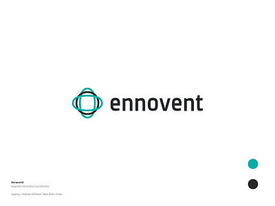
The logo is based on the Simon Sinek's Golden Circle of Innovation that depicts a pattern in the way great leaders and organisations of the world think, act and communicate; following a 'Why How What' approach instead of 'What How Why'. The circles also emphasise the distinctive adjectives of Ennovent's being: Partnership, Unity, Collaboration and Stability.
Also check out the attachment with the shot. Also, do check out other branding projects.
