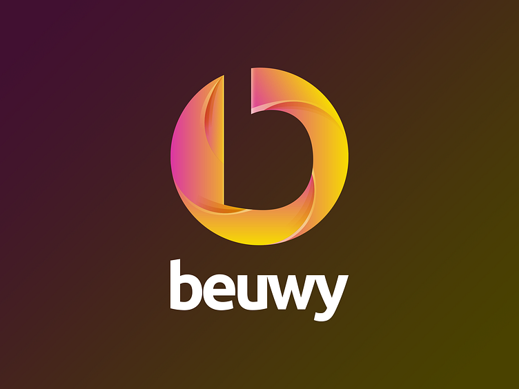
beuwy Branding and Logo
For our third shot we want to introduce to you our thoughts about our very own logo.
beuwy is my Mannheim, Germany based project of working with highly motivated and talented people without the agency hustle and maximizing efficiency. Bringing modern, digital world design and combining it with the german work ethics.
For the logo I wanted to underline our style, fresh and modern colors — ready to be spread onto our clients.
The subtle shadows of the icon make it feel like it is moving, even rotating. Same as we are. At the same time the shadows and the icon resemble the shutter blades of one of our most important tools: the camera. Everything while still underlining the importance of the "b".
Working with freelancers, that are not bound to anyone, is the "b"-way, the alternative that we are trying to introduce to conservative german clients.
Let me know, if you have read until here an what you think about the thoughts behind the logo? What were your first thoughts when seeing it?
Any feedback is highly welcomed!
Thank you so much for checking this shot out.
Much love from Mannheim, Germany.
