Glassdoor Ideation
For the last three months of my job searching, I have used Glassdoor. They're a fantastic company really looking to put transparency in the job searching industry (Thus the name of the company) Throughout the last three months I have noticed some flaws in the navigation and presented information on the job page. I decided for fun I would set out and tackle some of these problems I have encountered.
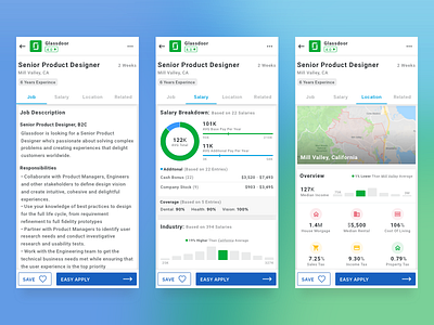
The main problem is the information given on a single job listing isn't very good. Information like salary is held on the company's profile and you need to search for your job title to find it. Secondly, you need to search for salaries for your industry to know if they're compensating you well or not. Third, you'll need to Google the location to ensure that the compensation is enough for the cost of living. (This is huge if you're relocating)
My solution was to set up two new tabs "salary" and "location". These allow you to understand the pay scale the job offers compared to what you might need if you are relocating. Among that, I added the years of experience above so you don't waste time looking at jobs you're under/overqualified for.
I believe these improvements will making finding the right job quite a bit easier and give more insight into what you need and what is fair.
*My Thoughts*
As fun as fully re-designing an app can be, I really wanted to practice improving on an already stable brand/platform. Keeping to Glassdoors brand while improving some visuals was both challenging and rewarding.


