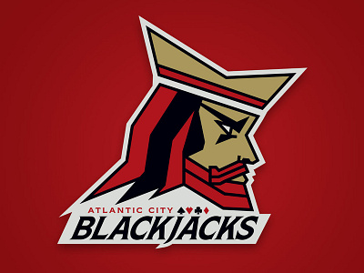
Atlantic City Blackjacks AFL Team Logo
Logo developed for a new Arena Football League team, the Atlantic City Blackjacks. Styled after the One-Eyed Jack from a deck of playing cards.
"The unique Blackjacks logo presents the attitude of the team, the emotion of the fans, and the thrill of the game. The dynamic angles in the logo represent a hard-set determination and attitude meant to intimidate anyone who dares to oppose. The logo portrays the team’s identity and the embodiment of a tough city with an independent streak looking to dominate the AFL with grit and confidence." - From the press release found here: http://acblackjacks.com/news/story/?id=16
More by Krystal Hinckley View profile
Like
