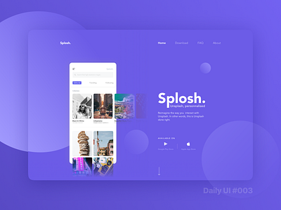
Daily UI Challenge #003 - Landing Page
What better content than your own? Splosh was an app concept that I came up with a few months back. In the process of designing this page, I was able to give more character to a previously just lightly thought out concept. I was quite unsure about how I'd actually go about designing this page since I read the details about today's challenge. That's because I've not really dwelled into desktop design that much. But what I learned from this one is that you just gotta start somewhere. By the end, I was honestly really happy with what I achieved. Again, not necessarily perfect but hey that isn't the point of these daily challenges.
Designed in @Sketch 💎
Also my first post as a 'PRO' Dribbbler 🤓
Hit 'L' if you like what you see 🔥
Let me know your thoughts in the comments! 😁

