Frisbee - Logo Design
Frisbee Logo Design
A first concept direction for a new project called Frisbee.
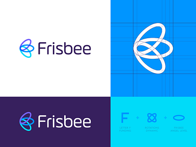
Frisbee is the name of the app where users can invest in startups at an angel level of investing alongside some of silicon valleys key private equity and venture capital groups.
For now I'm mainly focusing on the mark rather than the chosen lettering. But I felt these letters complimented the mark nicely and uses a same thickness of the mark which I usually prefer to see. As in previous posts I included some hints to the elements which I focused on such as Letter F + Dynamic shape + frisbee. I felt the shape of the frisbee also may be a fun little extra to the 'angel level' investors.
I'm curious if you may or may not have seen a similar design done before and what your overall thoughts on this direction is for now. Thank you for the feedback on all previous posts this week, highly appreciated!
Wishing you all a lovely weekend! _ _ _
Want to work with me? Learn more about me:
