Map of the Solar System
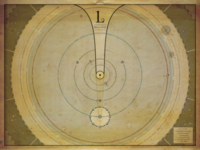
This is, in essence, is an infographic I made on our solar system for the folks at the Lantern Journal (http://lanternjournal.org/). The idea was to make a map of our solar system where someone with little, to no, reading skills could pick up and glean a basic knowledge of the way our solar system works. Included is the orbital (sidereal) periods of the four inner planets and two nearest gas giants, the time it takes light to reach the earth from the sun, the time it takes light from the earth to reach the moon, the lunar phase + functionality, a section of the constellations from the Greek Zodiac, and the current average life expectancy of a human being. Everything is set on a scale of 1.618 (aka. phi), or the golden ratio (1:1.618). A full exegesis, along with a larger jpeg can be found on my website's blog at: http://blog.equalandopposite.com/post/25524610704/here-we-have-my-latest-cover-design-i-did-for-the