Ouija glyph development

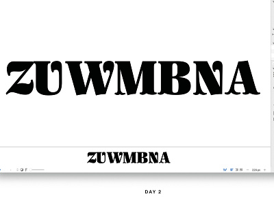
Screen grab of Ouija. At this point in the process, we were tackling the challenges of serifs and how they related to spacing. We felt that the flat top of the /Z looked too static so we altered it to have a curvy top. The ball terminals of the /U, /W and /N looked too dark in spacing proofs -- switching to tuscan serifs allowed for the characters to breathe.