Non-profit Website Design
The International Needs site is now live!! Had an excellent time working with the IN team designing their new marketing site. The client came to us as their donations were down and they had various issues with their site. Their previous site lacked focus, did not inspire visitors to donate, was difficult to navigate, and did not speak to how the foundation wanted to portray themselves.
We conducted a kickoff meeting to gain insight on the foundation and to solidify goals for the future site. We then moved into a Design Workshop to learn more on how the foundation wanted to convey their brand; in contrast to their current brand. With these results, we move through the product foundation phases. The foundation's largest donor base were 70 yr. old females. When creating the site architecture and wireframes, we wanted to ensure it was easy to navigate and also not overly complicated to build frustration for our older donor base.
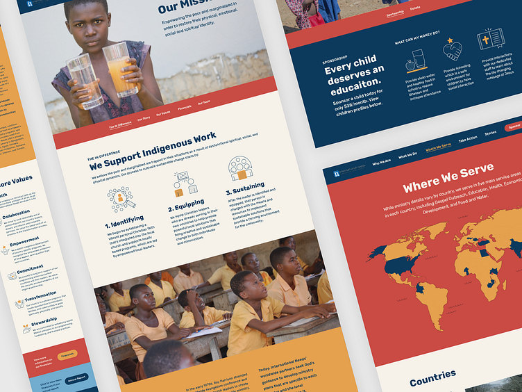
Through the design development phases, we created style tiles for the client to best fit their tone and manner moving forward. We kept their current brand color blue, but added in a toned down red, an off-white, and orange to add warmth and emotion to the palette. We also introduced icons throughout the site which freshened it up and added more focus. We refined down their copy and accompanied it with an illustration to gain more interest and understanding at a quick glance. We also added more value to their sponsorship and donation sections by including actual benefits they can provide with each donation/sponsorship price range. This was an essential piece as many donors voiced this via survey feedback. The new site is much warmer and focused to keep the donors informed and inspired to donate!
The launch was a success, and we can't wait to see how their donors react and how it will affect their donations in the future!