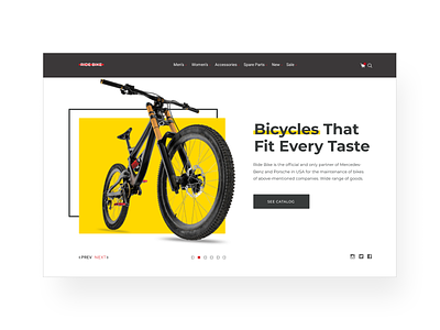
Bicycle Online-store. First screen
As a student of web-design studying course I had to develop the web-design for the bicycle online-store with the main page, catalog page and product page.
To convey the feeling of reliability, stability, tranquility I addedd square forms, horizontal lines that repeat bicycle frames or other parts.
More by Mila Lelyuk View profile
Like
