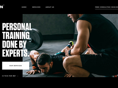
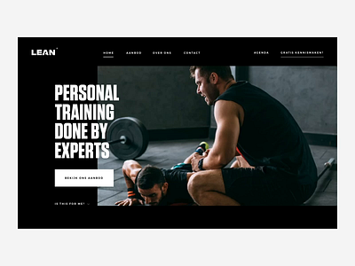
Lean Pageload
'Sup guys
Happy monday! Here's a pageload animation i did for Lean, a local personal training studio here in Ghent. In the pageload animation i wanted to highlight the services they provide before landing on the page, this way the user already has a quick grasp of the services.
For this project i did more then only the web/interaction design. I also did the visual direction for the identity. In a previous post i mentioned that i wanted to start posting more branding work instead of only web work. I'm posting my first branding shot in a couple of days for this project, looking forward to share more then only web/interaction with you guys!
Have a great day! Peace ✌
————————————————————
Get a free lesson about whitespace and balance!
https://mailchi.mp/2a1d8a58aff7/freelesson
————————————————————
Want to learn design and animation?
Use the links below for 2 months Skillshare premium for free!
Design class: http://skl.sh/2h4JrWa
Animation class: https://skl.sh/2D8StYQ
Hope you guys enjoy the classes!

