Platora - Logo Concepts
Recently got contacted to develop the Logo for a Financial Company, Platora. Their speciality is exchange rates in the financial market 📈
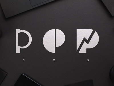
Out of the many sketches, these three concepts where the ones which stood out the most.
The first represents investing, more specifically, a coin being inserted inside a gap, this forms the letter P.
The second is a P inspired by a golden spiral, no direct association with finances.
The third is a P with an upwards graph on it's negative space, representing growth.
Would love to know which one do you prefer and why 🤙
More by Wisecraft View profile
Like
