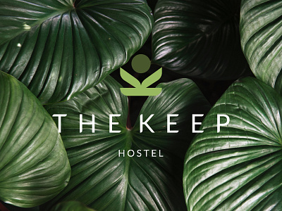
The Keep Hostel Logo Design
Judy Is Punk Studio designed a logo mark for The Keep - an Eco friendly hostel in Salzburg, Austria. The Keep is a new hostel being developed in Salzburg, Austria and is the first of its kind in the area - being the most sustainable built accommodation in Central Europe.
The Keep mark was designed to convey the owners free spirit and fluidity, hinting at plants growing under a unified group - in the shape of a sun or sphere.
The base and two stems also represents the letter K, being created with a symmetrical lockup - ensuring the hostels construction method is hinted whilst having a sense of “keep” to it.
More by John Bresciani View profile
Like
