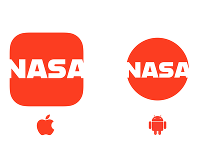
NASA App Icon - Daily UI #5
I wanted to take advantage of the space inside of the icon, while still preserving the NASA name. I chose the classic NASA red from the worm logo as well. I loved the font I found for this design, and I will continue to build upon this design for future dailyUI projects.
More by Scott Caudle View profile
Like
