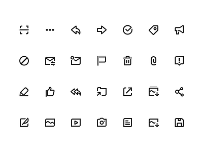
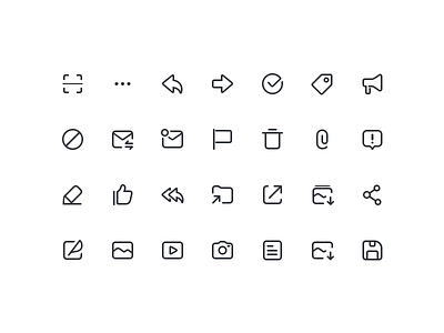
Function Icon Upgrade
To let the visual feedback more Operational, I try to make the weight of icons a little bit more heavier; Thicker, sharper, clearer.
Compare with the previous version, how do you feel? Hope you like this shot! :P
More by CDY View profile
Like

