Rutgers Dashboard Rev3
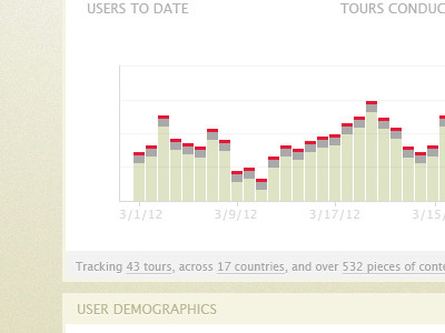
Based on the previous behavior of the data represented in this chart, I tried to make the chart look a bit like an equalizer using their brand colors.
What do you think? Rebound any charts you have designed that include a chart symbolizing or relating to music!
More by Charles Irizarry View profile
Like

