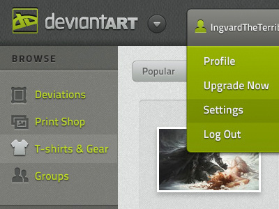
DeviantART web site
This is a scratch that just had to be itched. While I love the concept of deviantART, I hate the way it looks. I mean, I REALLY hate it. Unable to stand it any longer, I had to redesign it. There's nothing particularly earth-shattering here; I used buttons, icons and textures other very talented designers have created and generously made available online. I just wanted it to stop looking like ass. (I blogged more about it here: http://sean-ashby.blogspot.com/2012/06/redesigning-deviantart.html)
More by Ingvard the Terrible View profile
Like

