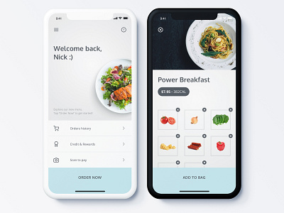
[Light/Dark] Food Ordering App UI/UX Design
Hey everyone!
I had shot with light version of this design but I decided to create both light and dark and still can't decide what looks better!
You can leave a comment below with your opinion of what you like more - light or dark version. I will be really happy to see your votes!
Thank you for watching this shot! I will appreciate if you press "L" to show that you liked this clean design!
More by SkyNick View profile
Like
![[Light/Dark] Food Ordering App UI/UX Design](https://cdn.dribbble.com/users/2199076/screenshots/6122094/light-dark-ordering-app_4x.jpg?resize=400x300&vertical=center)
![[Light/Dark] Food Ordering App UI/UX Design](https://cdn.dribbble.com/users/2199076/screenshots/6122094/attachments/1313071/light-dark-ordering-app.jpg?resize=400x300&vertical=center)
