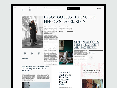
Magazine / Blog / News Site Landing Page Explorations
Daily explorations for text heavy page. Was always fascinated by how the newsletters pages are overcrowded with text and somehow manage to look balanced when done right.
What do you think?
-
Latest Case Study - http://bit.ly/2WRS5ra
- Wanna see some backroom shots - Instagram
More by Nikola Uzunov ☛ View profile
Like
