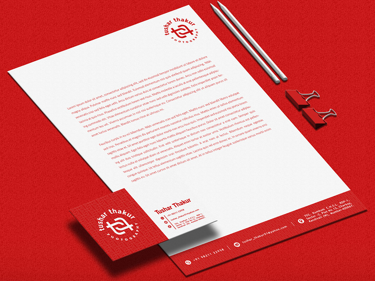
Tushar Thakur Photography Business card and Letter head Design
Really wanted the brand identity to look powerful and stand out, hence I incorporated the Red and the Brand pattern in both the letter head and the card. . Would love to know your thoughts! . You can check out my other works on https://www.instagram.com/matereal_designs/
More by Shubhang Rajput View profile
Like
