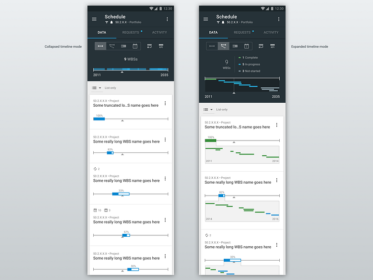
Schedule view: Collapsed & expanded timeline modes
BACKGROUND & HIGH-LEVEL DESCRIPTION:
After identifying the personas that would use this view, as well as their goals, it became clear that one single design approach would not serve all of their needs.
My solution to this problem was to create 4 different “modes” that users could select from. And we identified which mode would be the best default starting mode for each persona.
The mode selector is mutually-exclusive toggle control which presents 4 options just under the tabs. This shot presents 2 of those modes.
The top timeline presents the time period of all children WBS’s within the parent WBS that the user is at (in the dark background area). This gives the user an overview of the entire timespan.
After that, those children WBS’s are shown as list items, each with their own graphical battery-bar placed onto a “shared timeline” of the entire parent WBS (just like they are in the top area).
The upward-facing triangle is the “current date indicator”.
COLLAPSED AND EXPANDED TIMELINE MODES:
In the “collapsed timeline mode”, the top timeline in this area “collapses” the children rectangles into a single row – overlapping them as they naturally fall in the timeline.
In the children list-times, this sparse-data approach continues, only showing the battery-bar (with completion percentage), and a few other indicators.
The collapsed timeline mode offers the advantage of being the most-compact option. In this way, the user can fit more constituents into their viewport. While this offers that advantage, it is also the least-informative mode.
In the “expanded timeline mode”, all of the timelines “expand” to reveal the constituent children WBS timelines.
More data is presented in this mode, providing a more informative experience – perhaps at the cost of some extra verbosity.