Nashville SC
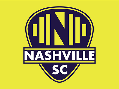
This is a logo redesign concept for Nashville SC out of Major League Soccer.
I didn't want to deviate too much from the leaked logo, but rather give it a touch up; ergo I utilized the same color scheme and general theming. I modified the sound wave "N" and change the crest to more identifiable guitar pick shape (versus, what I later found out was, the head of a guitar) along with some other tweaks.
More by Mark Lavis View profile
Like

