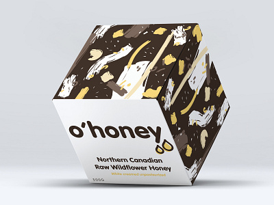
o'honey package design
This is my take on packaging for a Canadian based honey company called 'o'honey'. For this design, I wanted the overall vibe of the box to be appealing to a younger, millennial based target market. I wanted someone to pick up the box, feel the soft matte varnish and think it was a ‘luxurious’ seeming honey, but organic in brand values and aesthetic- organic strokes/shapes for the abstract design. I also wanted to ensure to make sure the fact that the product wasn’t lost in this approach, thus limiting my colour palette to browns and yellows.
Like
