Daily Logo Challenge - Day 18 - Cakecup
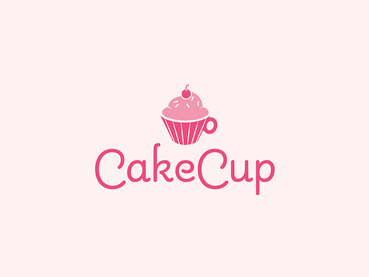
Day 18 is a logo for the confectionary company "CakeCup"
As a Company specialising in a quick, consumable product I wanted to put this front and centre in the logo, match it with a warm, welcoming colour palette and some friendly, rounded and semi-script typography.
Personal criticism first - I think the icon is a little too detailed and if I had more time on this I would probably do versions to see what I can strip out and still keep the idea.
Otherwise, I'm pretty happy with the concept - result. Roll on day 19!
More by Finbar View profile
Like
