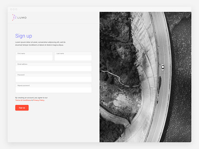
Lumo sign up
When designing the Lumo sign up and login pages we used it as a good opportunity to transition from the bolder visual design of the marketing site to the more utilitarian look of the apps. The bold black and white photos from the website are carried over, but the remainder of the page gets more minimal as a gateway to the SaaS app interface.
See a complete case study for this project at: http://benek.nz/work/lumo
----
Need a design partner for your next big project? Contact me at benek.nz
More by Benek Lisefski View profile
Like

