Data Visualization about salaries

Happiness at work perceived by designers.
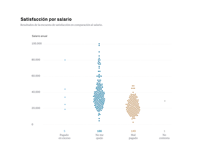
The first column is "I feel I earn too much"
The second column "I'm fine"
The third "I feel I don't earn enough".
The forth didn't respond (only 1 result).
It's interesting to see that after 50.000 nobody feels they should earn more.
This is the last graph of 8 data visualizations about the salaries of designers in Spain.
I turned the data collected from an anonymous Excel sheet into visuals, using various data visualization techniques and tools!
