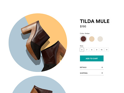
100 Days of UI — Day 12 — E-Commerce Shop
Based off eCommerce UX best practices, I wanted to make sure I included a clear CTA and price information above the fold. The details and shipping containers are expandable to keep the item page clean and straight forward. To break from the traditional product shots on E-Commerce sites, I experimented with using circle imagery and bold color.
More by Mallory Short View profile
Like
