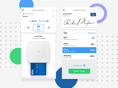
Mobile POS: Payment / Tipping
Often we see products that ask the user to conform to how the app should be used than making an application feel more human and conform to the user's needs. I believe the more human a product is the more enjoyable and easier it is to use, BUT the flow I instilled for the completion of this order will ask servers to conform to best practices.
I.e asking if the check is "separate or together" first, then taking their order. I did this so each item can be assigned as the process moves forward rather at the end when you have a dozen items to sort through.
Another thing I really wanted to give some thoughtfulness to is the tipping section. It's easy enough to give a number field and call it good but I feel there is a big disconnect with tipping. So Instead of input, I used a grading scale so that the merit of the server could shine through!
---
I had this idea one day to create a low barrier entry mobile POS for waitstaff. If you're interested I wrote a full case study about my process in creating this app (https://link.medium.com/LeXxlcxBmU)
*My Thoughts*
"How do I get the customer to understand that the tip isn't just a percentage but a reward for working hard?"
Trying to instill empathy on a customer is extremely difficult. My attempt here was to force the user to focus on merit and hard work than thinking about an arbitrary percentage. Not everyone deserves 15% some a lot more and some a lot less.


