Leeds England Re-Branding Campaign: Print Design
The city of Leeds, England was seeking a rebrand to boost tourism. A town with stunning architecture was rigidly divided between the suits of their thriving financial district and the "rowdy" university students. I wanted to promote the unity and energy that courses through the city’s Yorkshire roots, capturing the city’s pride not only in it’s buildings, but it’s people, markets, museums and bar scene.
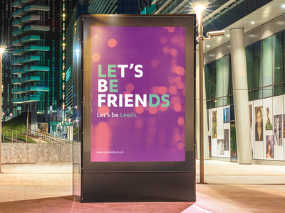
I centered around a tone of voice and typography campaign that featured sentences with “hidden” Leeds, as well as a fresh, upbeat, modern color palette and type face. These sentences promoted not only targeted messages that highlighted various aspects of Leeds, but also finding the hidden gems littered about the city.
