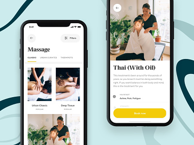
Urban - Treatments
While returning users had almost no problem with it, we noticed the treatment detail was one of the two screens where new users would spend most of their time when using Urban. After interviewing with the user, we defined what's most important to them and how we could display it so they can feel comfortable with their choice.
We changed the list and the detail screen so that it gives a brief idea about why you should book a specific treatment and what benefit you should expect from it. It didn't only increased the conversion rate but also decreased the number of complaints caused by wrong expectations.
We'll post a demo of the full checkout flow soon, but since you're here you can check other shots on our profile or download the iOS / Android app.


