HH Logo Mark
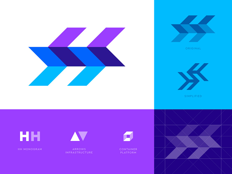
Here is a mark that I’ve been working on recently. It’s for a container service and the name of the company includes HH.
This design may look like arrows forward and backward but the little extra is the hidden H letters used in a depth field to visualize the containers a little too. 🚢 📦
Currently looking for feedback and hear what you think of the initial concept direction using these elements. Also am curious if this is been done before in the similar way
A more simplified version on the right, which also helps to visualize the original letter intersection a little more.
