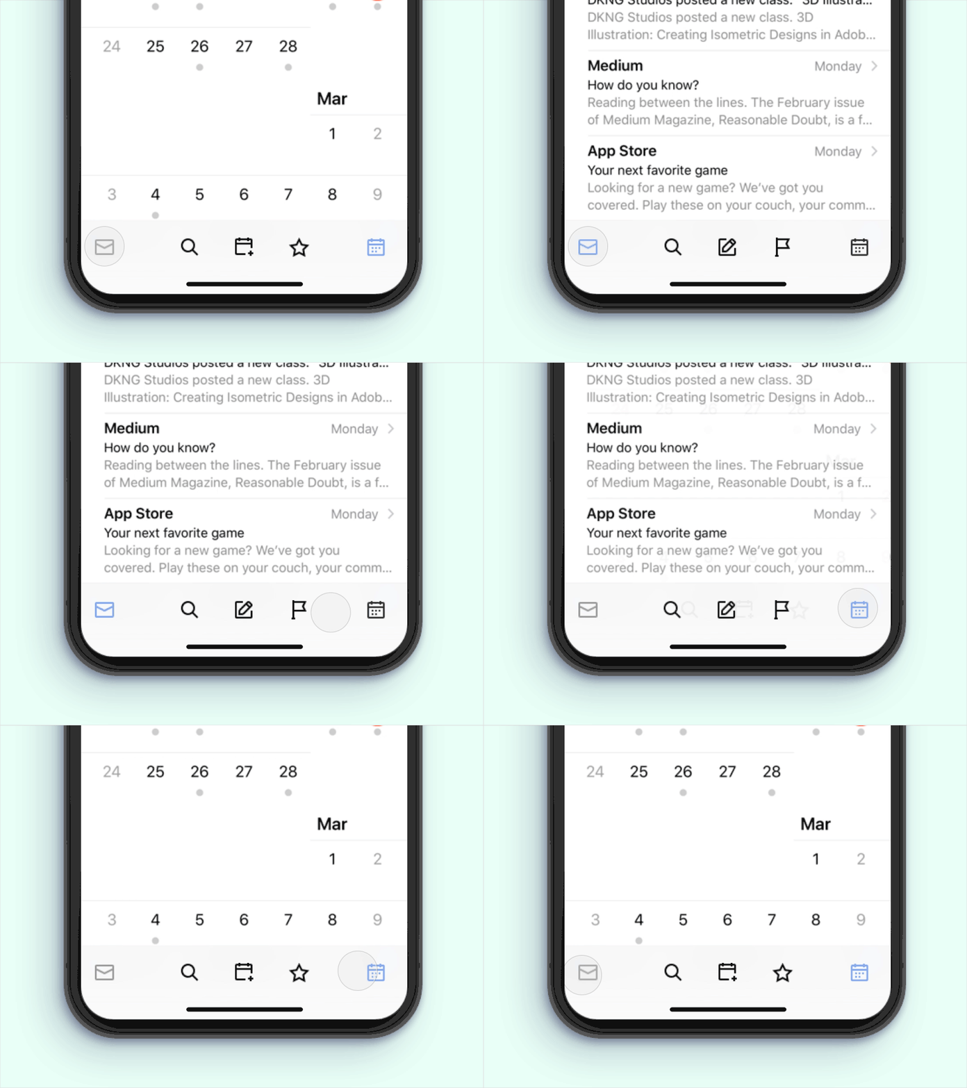
Dynamic TabBar
Another representation of @Ami's Switching from Email to Calendar on NavBar interaction.
I will show the various button layouts I tried before coming to this clean version of navigation. Obvious layout which can be transformed into this clean version by forming pattern. Remember the time when tabbar used to be icons with label design. Users are now familiar with frequently use icons. Like wise forming a pattern through interaction to avoid unnecessary elements.
UI/UX Interaction Collections Vol 1.0
Micro-interaction Collections Vol 1.0
More by Paarth Desai View profile
Like

