Ellecta (2014)
The interactive agency Ellecta asked me to do a refreshment of their brand.
Their old logo was an octopus that symbolized the ability to quickly and effectively adapt to changes on the market, which they wanted to push to the next level.
There were many early sketches until we defined the direction we want to go with.
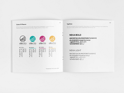
After distilling the idea I used minimal approach and focused on the single tentacle that is enlarged so it’s not defined by boundaries. Also, when rotated at a 90-degree angle, the logo takes the shape of the letter “E”, the first letter of the agency.
Additionally, I designed the identity style guide book that holds all necessary rules, guides of their new identity and stationery items.
Check out the agency website here 👇
www.ellecta.com


