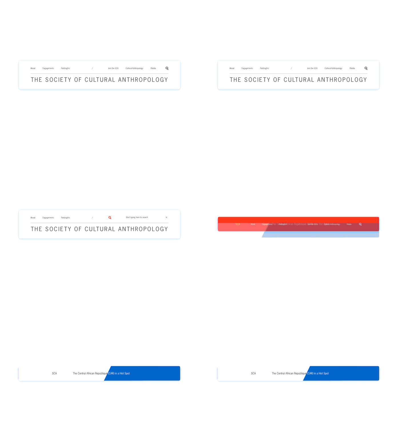
Navigation Shifts
Working through a few different stages of the top navigation for a client. Each color representing a different part of the site users would occupy; blue whilst reading an article (and being told what percentage they have remaining based on how full of blue the bar is), red for a separate section, and the search bar moving over once activated.
More by Foster Made View profile
Like
