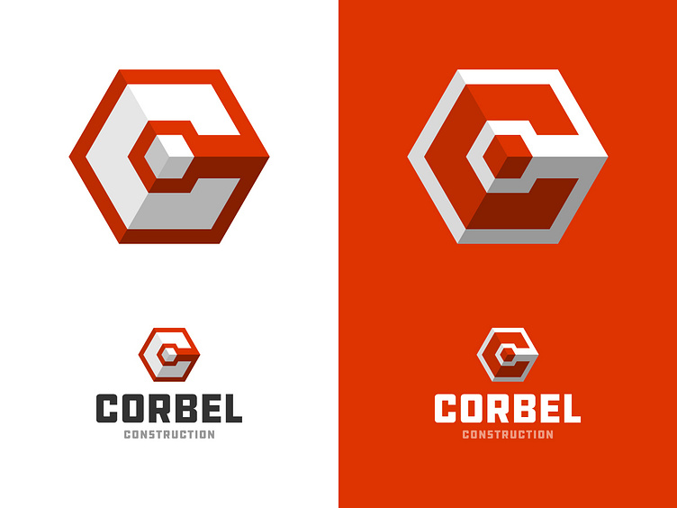
Corbel Construction
A slight update to the Corbel Construction logo. I added some opacity to 2 faces of the hexagon to bring out the cube a bit more. I'm not usually a fan of making things look 3D, but I think this worked quite well and is clean, sharp and not too in your face.
What do you think?
More by Logo Positive View profile
Like
