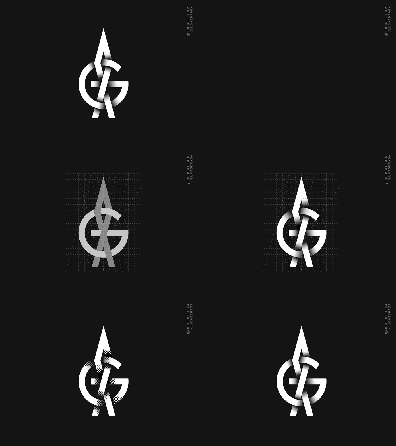
Logo process (and a little history)
When I studied industrial engineering, I was enchanted by the technical drawing. Then when I studied fine arts and opened up all the possibilities I could in the drawing, I ended up peering through typography and design. My teacher, Marcelo Drumond, gave me a great bibliography that opened and a lot of my head. Back then, as a teenager, I had already been attracted by typography and I was very curious about the shields of football teams here in Brazil. I saw that some of them are built by monograms: Flamengo, Fluminense, Vitória, Campinense, Tombense and Internacional are just a few of them. I find it very interesting to think of the infinite possibility of representing and constructing two or more letters intertwined. Here, I share a bit of my process. After I have an idea, I draw and work (almost) always with grids. I made the logo up without any pretension. I wanted to do an A + G but I preferred to let the things happen. When I see the end result, I do not see an A with a G, but a G on fire. What do you see?
