The Mighty Five®
Ex 7 - National Parks
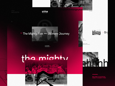
Seventh installment of the @Magnetic Creative design team exercise was one I was a little stumped about right away. When I think of the topic National Parks there are a lot of executions that come to mind that all start to feel a little bit the same.
The biggest challenge I try and take on with each and every one of these is to do something different and really push myself creatively to one-up myself from the last one. I wanted to steer clear of any obviously outdoorsy trending layouts and focus more on the interaction of typography and imagery throughout the layout.
I've been pushing myself not to rely on big beautiful imagery to be the wow factor as much as I have in the past. @Mani Salazar introduced me to the main headline font and paired with the stocky serif I've used on a couple of these already, it creates the same kind of juxtaposition or contrast that my color choices do.
I treated all the imagery with this gritty black and white feel to gain some depth and texture throughout some specific areas of the comp. And I couldn't resist throwing the Grizwolds in the mix of this one.
Pixels attached.
-
Searching for your True North? We would love to hear about how we can help. Email us hello@mag.cr