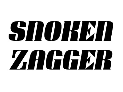
Typeface
Working on a typeface inspired by Bodini Poster. Caps Only. Having some troubles with E, F, V and W. Can't find the balance between the shape and whitespace of those letters. The E & F looks to sharp and the V & W have way to much whitespace. Tricky.
Would love to here your first impressions.
More by Erik Iggmark View profile
Like
