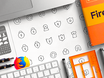
Firefox Monitor glyph, pictogram, display, typedesign
Usually, to find a strong and memorable shape for a logo, we combine two visual metaphors. We believe in dopamine that hits when a viewer recognizes not only the most obvious shape but also experiences an "aha" moment. That makes him/her feel a bit smarter and more curious at the moment. The mind considers it as a positive, helpful experience, and the viewer remembers that for a longer time.
We create a 10x10 matrix with brand attributes/tags duplicated vertically and horizontally. And then we draw around 90 low-fidelity sketches to define the most promising pairs.
More by Ramotion View profile
Services by Ramotion
Like


