Mcdonalds Redesign
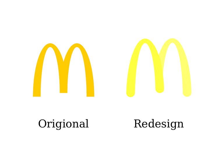
Here is a redesign of the McDonald's logo next to the real one. I wanted to change the mustard yellow to a brighter color and create a slight contrast between the two sides of the M, making the first part appear closer.
Here is a redesign of the McDonald's logo next to the real one. I wanted to change the mustard yellow to a brighter color and create a slight contrast between the two sides of the M, making the first part appear closer.
