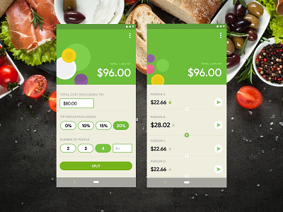
Calculator, Split The Bill
What's worse than slamming your foot into the door frame, getting rid of air bubbles on your smartphone screen protector, or the apocalypse?
Answer: splitting the bill with your friends.
Your friends don't mind to split evenly, but then that one friend got two extra drinks AND a prosciutto appetizer. Plus, the restaurant doesn't split the bill for you, which is bad customer service...
Enter Daily UI Challenge, Day 004 - Design a Calculator!
Things that I've learned:
1. While green remains the second most popular colour in web design (next to blue), it's harder to use for contrast & accessibility reasons. Sadly, lovely light shades of green just don't work well with functional items.
2. A calculator doesn't have to look like a literal "calculator" (which is tempting to design) — rather, this is a tool to help get cost estimates divided fairly between your best mates.
3. This was the first time I've used Google Sans in an Android design (versus previous Roboto efforts). Despite suffering from geometric sans fatigue, I like the typeface.
Bon appétit!
