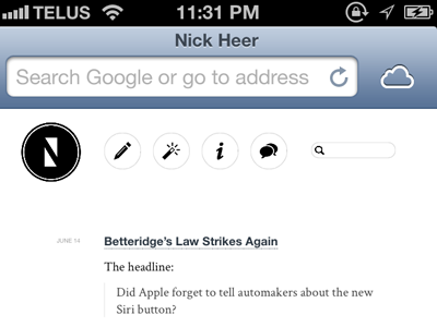
Better iCloud Tabs?
I think iCloud-synced tabs is one of my favourite new features across both Mountain Lion and iOS 6, but I feel the implementation on the iPhone is a bit weak. I think a button on the top toolbar would be more logical than placing it in bookmarks, and would integrate the unified address bar in Safari 5.2/6. I could be wrong, and that's probably why I don't work at Apple.
Big size is at http://nickheer.com/shh/icloud-tabs-better.png
More by Nick Heer View profile
Like
