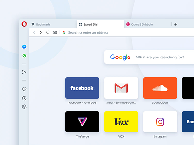
Opera Reborn 3 Design
Hi Dribbblers!
Last week we've released the developer version of the new Opera browser (v.59), codenamed R3 (Reborn 3).
With R3, we put Web content at center stage. We’ve removed dividing lines between sections so you can browse without borders and unhindered by unnecessary distractions. And, just as no one frame is effective for every picture or in every lighting, we’ve given the browser two distinct themes, light and dark.
The design of each of these themes was inspired by high-key and low-key lighting photography, where the goals are to maximize or minimize the amount of light in a photo while still retaining contrast. Depending on your mood, your setting or the content you are viewing, you are in control of how you frame it.
Hungry for more?
• Check out attachments for a closer look.
• Read more about R3 design changes on our blog.
• Download developer version and test it (you'll find installation links at the end of blog post).
• Visit our Reborn3 page and sign up there to get the latest updates from our team.
We also encourage you to follow our team here on Dribbble.
Have a nice day!


