Tired
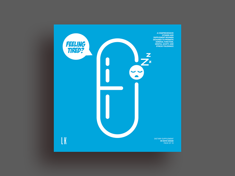
Just completed a package box design project for a company who are into healthcare supplements. I did their entire supplement range design. Sharing one of their range called "Tired". Will be sharing the rest soon. The preference was to keep it clean, minimal and relevant with a bit of fun. While designing the same, I preferred to keep their capsule (i.e their supplement) as the main central design element. For their multiple range, I contemplated to create a design where their range can be integrated smoothly with the main capsule design element keeping the design consistency as well as minimal aesthetic appeal. So I created and creatively integrated their multiple range as icons as a part of the capsule itself. Hope you like the same. Thank you. Link to multiple screenshots here - https://bit.ly/2tvJ8GI