Washougal Coffee Company Branding
In posting a @stickermule coaster shot earlier today, I realized I hadn't posted this branding project yet. It's one of my favorites I've worked on.
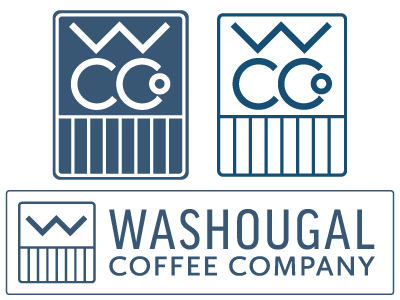
Here are some of the details behind the design: - Washougal (a small town in Washington state, not far from Portland, OR) provides amazing views of Mt. Hood and other nearby mountains which are always on the horizon (the W calls this) - The color is a natural, warm blue color recalling the water that the community is surrounded by (the Columbia & Washougal Rivers) - Designed to be clean, simple and intentional. Modern, yet traditional and with history behind it. I aimed for something akin to the Craftsman era when beauty was expressed through materials and simple form rather than ornamentation, an approach that is very much at the historic heart of the community. - The vertical lines recall the Chinook symbol for water, and in this format are similar to the Chinook symbol for ‘house of water’ which was a practical community gathering place.
