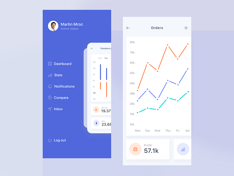
Menu Concept for Mobile Devices
The main purpose of a dashboard is to show important data, without forcing user to spend much time to go through it.
Therefore, it’s crucial that all the information easy to read, graphs have to be distinguished by different colors.
Here is my take on dashboard, which contains different types of data organized in boxes to enhance its readability.
If you like it, check out more of our work
More by Martin Mroč View profile
Like
