Daily UI 006 — User Profile
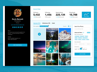
Day 6 of my Daily UI 100 days challenge. The challenge was to create an user profile page and I decided to create a UI for an image sharing website. See the attachment for the 2x view—the real pixels.
Let's pretend for a moment that this is a real website. So, there are mainly 4 sections in it:
1. The left side is dedicated to all the user information. You can click the little button above the image to quickly change the profile image — or click the big blue button to edit all information.
2. The top bar is dedicated to the quick stats and insights about the account — you can click on the "More Stats" button to see, well, more stats.
3. Below that are all the images that the user has uploaded, also the collections he/she has created and other photos that he/she has liked.
4. The right section is completely dedicated to search your own photos. There are several filters to choose from to refine the search. The filters that you have chosen will be shown above the photos — which you can clear one-by-one, or, click on the "Clear All" button next to "Advanced Filters" to clear all at once.
What do you think of it? I’d love to hear your opinions.
Press F or L to like the shot and leave a comment. Make sure to follow me for upcoming icons and UI design.
I am available for collaboration and freelance projects. Just send me a message and we'll discuss the project.

