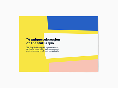
Open Door Centre Slide
The project and the re-brand began with some in-depth conversation and discovery. Speaking with the people from the Open Door Centre helped me to understand their identity at its core and from here I could work towards creating a brand that evoked feelings of optimism, progress and opportunity.
I started by choosing a more friendly and less imposing font in a lower case to give a more approachable feel. I then edited it slightly to create a feeling of balance and harmony. This was highlighted further by adjusting the existing colour palette to more pastel tones and adding the soft pink as an accent colour.
Head to my website to see the full case study
More by Lewis Dohren View profile
Like
