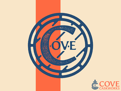
Cove Barrel Mark

Continuing with this self initiated brewery branding project, here is another logo element.
Cove is a barrel aging specialist, so this logo element includes a top down view of a barrel with the Cove letters inside. The C also acts like a literal cove for the other letters to nest inside of.
I'm happy with how I was able to include those two features without it feeling forced or too hamfisted. Always nice when you can accomplish that.
More to come!
-
