Re-brand Part 2
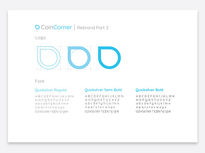
Hi guys, here’s a look at how the new CoinCorner logo was created. In redesigning the logo, we decided to go for a simplified and flat icon which looks effortless across our website.
The final design keeps the shape of our old logo, but reduces the size of the lines for a sleeker and cleaner aesthetic. We’ve done away with using different shades of blue in the one shape and feel that the new logo reflects our Bitcoin services - easy and simple.
Known for its geometric feel, our chosen new font is Quicksand. It’s a popular font and for good reason - it makes online reading clear and uncomplicated. With three different weights, we’re able to accent important text as we know many people tend to skim over content rather than read it word-for-word.